
 Best Platforms
 Live Odds







What Is a U.S. Senate Forecast, and How Does It Work?
An explainer that puts “U.S. Senate forecast” pages in plain English — the three core numbers they publish, race ratings vs win probabilities, where the inputs come from, how simulations produce control odds and seat distributions, and how market prices map to implied probability so you can compare sources without mixing definitions.
You’re looking at a Senate forecast page and it’s throwing a lot at you: colored maps, “Safe/Likely/Lean/Toss-up” labels, a percent chance to control the chamber, and a weird-looking distribution chart. You want to know what those numbers actually mean before you trust them—or trade against them.
Get this wrong and you can compare apples to oranges: a label that isn’t a probability, a topline percent that depends on a simulation step you didn’t notice, or a market price that you treat like a forecast. This explainer shows you how to read the outputs, trace where they come from, and sanity-check any Senate forecast fast.
Forecast page outputs
A U.S. Senate forecast page is a product with two layers: (1) expectations for each individual race, and (2) a single “who controls the Senate” probability computed by aggregating uncertainty across all races. In practice, that topline is usually generated by simulating the whole map many times—for example, Decision Desk HQ reports running 1,000,000 simulations “for every state in the Senate,” and shows an overall 52% chance for Democrats vs 48% for Republicans (as of 2026-09-21).
Three core numbers
- Race-by-race outlook: for each state, either a win probability or a rating label that summarizes who’s favored.
- Chamber-control probability: the chance each party ends up with a majority, derived from aggregating all races (often via repeated simulations).
- Seat outcome distribution: a chart of how often each possible seat split shows up across those simulated elections (often shown as a “seat-margin distribution”).
What pages visualize
- Map or table view of every race, colored by party/lean.
- Ratings/probability legend that defines how labels map to numeric cutoffs (one page sets “Lean” at 60% and “Likely” at 75%).
- Topline control % plus a seat-distribution chart showing the range of plausible outcomes.
- A “last updated” timestamp (some pages update daily at 6:00 PM Eastern Time).
Ratings vs probabilities
Some Senate forecasts speak in race ratings—category labels (Safe/Likely/Lean/Toss-up) that summarize which party is favored, without necessarily stating an explicit probability. Others publish a win probability—a numeric estimate (like 52%) of how often an outcome would occur across many hypothetical reruns under the model’s assumptions.
Ratings are fast to scan and easy to map-color, but they’re lossy: a single word has to hide both “who’s ahead” and “how confident.” Probabilities are harder to read at a glance, but they’re explicit—and they let you compare two races (or two publishers) without guessing what the label implies.
The trap is assuming the labels are standardized. The Cook Political Report, for example, uses a seven-point spectrum from Solid D through Toss Up to Solid R. Another publisher can use the same English words but attach different numeric cutoffs. On 270toWin’s FiftyPlusOne Senate Forecast map, “Safe” corresponds to a 95% win-probability threshold.
“Toss-up” is the most commonly misread label: many readers treat it as exactly 50/50, while some publishers use it more loosely as “plausibly either way.” If you’re comparing senate forecasts across sites, treat ratings as publisher-specific—then look for the page’s legend/definitions, or rely on the numeric probabilities when they’re provided.
Worked example: FiftyPlusOne’s label cutoffs (270toWin)
Here’s what “publisher-specific” looks like in practice. On 270toWin’s FiftyPlusOne Senate Forecast map, the same underlying number (a win probability) is also translated into a label using explicit cutoffs on that page.
- If a party’s win probability is 60%, the race is labeled Lean for that party (because 60% is the threshold for “Lean”).
- If it’s 75%, the label becomes Likely.
- If it’s 95%, the label becomes Safe. (270toWin’s FiftyPlusOne 2026 Senate Forecast definitions)
That mapping also clarifies what “Toss-up” means on that map: it’s what you’re left with below the 60% Lean threshold, not a claim that the race is exactly 50/50. So two races could both be “Toss-up” while sitting on very different numbers (e.g., one just under 60%, another much closer to 50%)—and you can’t know which without looking at the probability itself or the legend/cutoffs.
Where numbers come from
Senate forecasts usually start with polls, but the published probability is rarely “just the latest poll.” Race to the White House describes its 2026 Senate Forecast as “data-driven,” and says it factors in the latest polling alongside historic trends, candidate quality, and fundraising. That’s the classic blend: polling for the current signal, plus fundamentals (non-poll indicators like money and past patterns) to keep the model anchored.
Not every forecast is a single formula, either. Inside Elections says its race ratings use no specific formula; it weighs inputs such as past results, demographics, incumbency vs. open seats, fundraising, polling, and the national environment, and its goal is the likelihood of winning—not the eventual margin.
Some modelers also tell you how those ingredients get combined. FiftyPlusOne says its House and Senate forecast draws on Bayesian models (updating prior beliefs with new data) and research on correlated election polling errors—so one shared miss can move many races at once.
Simulation creates control odds
A Senate forecast usually doesn’t compute “control of the chamber” by just combining race win probabilities as if every state were independent. Instead it runs a Monte Carlo simulation—a method that repeatedly draws random outcomes from uncertainty ranges to approximate the probability of complex events like overall Senate control.
Here’s what one simulated “election world” looks like under the hood:
- It draws an outcome for every race from that race’s uncertainty (polling + other inputs).
- It also draws a correlated polling error—when polls are wrong in the same direction across many races at once, rather than being independently wrong race by race—so several states can swing together.
- It totals up seats and checks whether either party reaches 51 seats (a majority).
Do that tens of thousands of times and you can summarize the results in two outputs readers actually use.
First is the control probability: “Party A controls the Senate in X% of simulations.” That number can move even if no single race’s displayed win chance changes much, because shifting the model’s shared error (the “everything moved together” draw) can fatten or thin the path to 51.
Second is the seat distribution (or seat-margin distribution)—a chart showing how often each possible Senate seat split occurs across simulated elections. FiftyPlusOne, for example, notes that its histogram visualizes only a subset of its simulations and even shows individual runs as individual squares to emphasize the spread.
One last nuance: the median projected seats is the middle seat outcome across simulations (half the runs above, half below). It can differ from the average, especially when the distribution is lopsided.
Markets map to odds
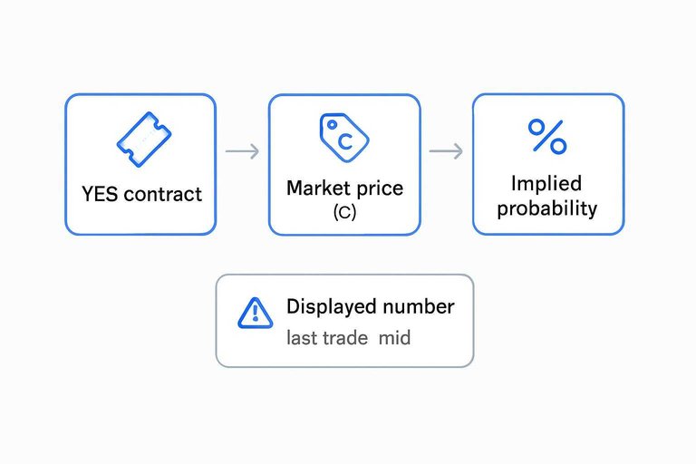
A prediction market turns a Senate question into an event contract / YES contract—a tradable claim that typically pays a fixed amount if the outcome happens (and $0 otherwise). From there, people read an implied probability—a probability backed out of a market price (for example, a 65¢ “Yes” is often read as ~65%).
Mechanically it’s simple. Kalshi explains that a “Yes” contract pays $1 if the event happens (and $0 if it doesn’t), and that a “Yes” price of p cents implies a market-implied probability of about p%. Polymarket similarly says winning shares pay out $1.00 USDC at resolution, and that prices (odds) represent the current probability of an event occurring.
The common misread is treating any displayed number as “the” probability. A market page might show the last trade (the most recent executed price) or the mid (halfway between the best bid and best ask). Last trade can lag if nothing has traded recently; mid can move even when no one would actually fill a trade at that exact price.
Also, price-as-probability is a useful shorthand, not a guarantee: research disputes whether market prices are always calibrated as literal probabilities. If you want to compare across venues, MarketsPrediction is built for scanning the same Senate-control event across platforms with their live odds, volume, and liquidity side by side.
Sanity-check any forecast
Use this checklist before relying on a Senate forecast (or a Senate-control market quote).
- Definitions first: Find the legend for rating buckets and what “Toss-up” means on that site. Some publishers explicitly use “Toss-up” as “plausibly either way” (not a precise 50/50), while others define it via numeric cutoffs.
- Freshness: Check the “last updated” timestamp and whether updates are continuous or batch. If the page discloses how many simulations it runs per update, read that as a description of how it generates the topline, not a quality stamp.
- What races are included: For 2026, there are 33 regular Senate seats up. Make sure the forecast’s map math matches the cycle (see the cycle-level seat count context).
- Control rules: Verify how it treats independents/caucusing and how a 50–50 outcome is classified.
- Calibration limits: Look for published calibration/backtests (calibration = “do 70% events happen ~70% of the time?”). If you’re benchmarking against market prices, note empirical work disputes treating price-as-probability as literal calibration without additional conditioning (including on time to expiry and product type).
Read the odds, not the colors
A Senate forecast isn’t just a map of “Safe/Likely/Lean/Toss-up” races—it’s a race-by-race view plus a simulation that turns shared uncertainty (including correlated polling error) into a single chance of reaching 51 seats and a seat-distribution chart. So don’t treat a label as a probability, and don’t treat a chamber-control percent as a simple sum of state-by-state favorites. Before you compare two forecasters—or compare a forecast to a market’s implied probability—start with the page’s definitions and control rules, then check freshness and what races are included. Once you do that, the numbers stop being decoration and become something you can sanity-check and use.
Frequently Asked Questions
- Why do some senate forecasts track 33 races while others show 35 for the same cycle?
- For 2026 there are 33 regular U.S. Senate seats up for election, but some trackers also include any special elections, which adds extra races to the map and changes the math behind “who controls the Senate.”
- Is a “Toss-up” in senate forecasts literally a 50/50 race?
- Not necessarily—some publishers use “Toss-up” as a loose label meaning “either outcome is plausible,” while others tie it to explicit probability cutoffs, so you have to read that site’s legend before comparing labels across forecasts.
- Are prediction-market odds the same thing as a senate forecast probability?
- No—prediction markets price event contracts, and while traders often read the price as an implied probability, research finds market prices are not always calibrated as literal probabilities without additional conditioning.
- Why don’t “Yes” and “No” prices on Senate-control markets add up to 100%?
- Because you’re looking at tradable prices (not a single unified probability), and bid/ask spreads plus whether the page shows last trade vs mid can make “Yes” and “No” look inconsistent at the same moment.
- How do I quickly compare Senate-control odds across Kalshi, Polymarket, and other platforms without flipping between tabs?
- Use a cross-platform odds aggregator that shows the same Senate-control event side-by-side with liquidity/volume and a clear “last updated” timestamp; MarketsPrediction is built for exactly this kind of comparison.